Anatomy of a B2B SaaS Landing Page
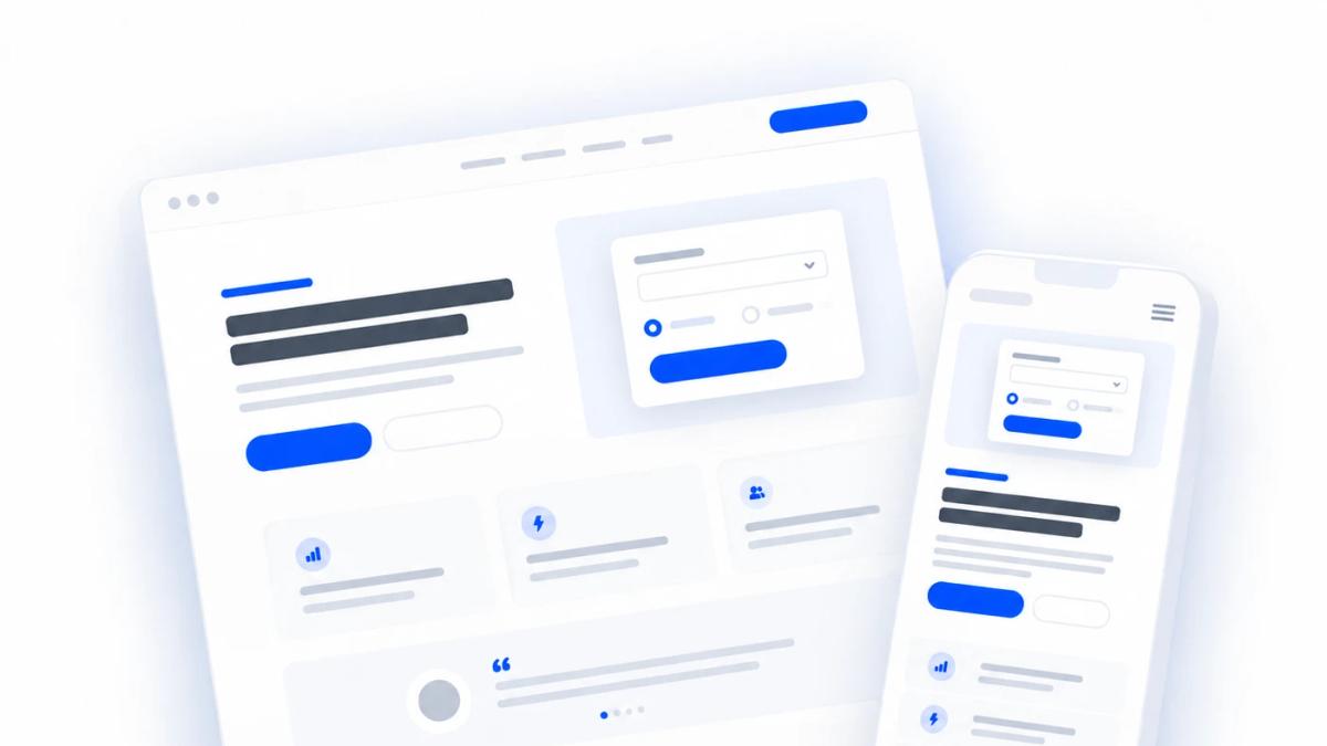
A great B2B SaaS landing page isn't a brochure - it's a sequence of small decisions, each one either earning the next few seconds of attention or losing it. Here's the anatomy of a page built to convert, section by section, plus a few elements most teams forget.
Above the fold: what visitors see first
Pre-headline / eyebrow
The small line above your headline does one job: tell the visitor “yes, this page is for you.” Name the ICP directly (“For B2B SaaS marketing teams”) or lead with a proof point (“Rated 4.8/5 on G2 by 500+ teams”). Either works - what doesn't work is a generic tagline that could belong to any company.
Headline
One sentence, one benefit. The best B2B SaaS headlines name the specific outcome or the specific pain being removed - not the category of software. “Stop wasting money on landing pages that don't convert” works because it's concrete and painful. “The best landing page platform” doesn't, because every competitor's headline could say the same thing.
Subheadline
This is where the headline earns its credibility. Explain how the outcome happens and add a specific, believable detail - a timeframe, a mechanism, a number. Two sentences is usually the ceiling before you start losing readers.
Primary CTA: lead with value, not a verb
“Start your free trial” describes what happens to you (a signup form), not what you get. “Run your first test”, “See your first report”, or “Get your audit” describe the outcome of the click. The button copy should complete the sentence “I want to ___” from the visitor's point of view, not the product's.
Secondary CTA
Not everyone above the fold is ready to convert on the primary action. A secondary CTA - “See how it works,” a link to a case study, or a chat option - gives that visitor somewhere to go instead of bouncing. Keep it visually quieter than the primary button; it should never compete for the same glance.
Objection handling, right under the buttons
The three or four seconds after someone considers clicking is when doubt shows up. A short line - “No credit card required,” “Setup takes 90 seconds,” “Cancel anytime” - answers the objection before it's fully formed. Keep it to the specific friction point that's actually stopping your buyer, not a generic reassurance.
Social proof
A single strong testimonial, ideally with a name, title, and company, does more work here than a wall of quotes. Specificity beats enthusiasm - “Cut our CAC by 31% in six weeks” convinces; “Great product!” doesn't.
Trust logos and industry badges
A “trusted by” logo bar or G2/Capterra badges lower perceived risk fast, especially for buyers who've never heard of you. Keep logos recognizable to your actual ICP - five familiar names beat fifteen unfamiliar ones.
Engagement-first form
Instead of opening with a full contact form, open with one low-friction question relevant to the visitor's problem - a quick audit question, a “what's your biggest bottleneck” selector, a URL field to analyze. The visitor engages before they've committed anything personal, which lowers the barrier to that first click dramatically.
From there, a multi-step flow reveals a partial result and asks for more - work email first (it doubles as a lead-qualification signal and lets you auto-fill name and company via enrichment), then any remaining detail. For sales-led teams, the final step is usually a Calendly or scheduler embed, so the visitor books time while they're still warm instead of waiting on a follow-up email.
Below the fold: making the case
The problem
State the problem your ICP actually has, in their language, before you talk about your product at all. This is where visitors decide “yes, that's me” - skip it and you're asking people to care about your solution before they've agreed they have the problem.
The solution
Introduce your product as the direct answer to the problem you just named, not as a feature list. One clear sentence on what changes for the visitor once they're using it is worth more than ten bullet points on what the product does.
Proof others have already solved it
A short case study, a before/after metric, or a second testimonial - ideally from a company the visitor recognizes or resembles. This is where skepticism turns into belief, so specificity matters even more here than above the fold.
Steps to solving the problem
A simple three- or four-step outline of how someone goes from “signed up” to “getting value” removes the vague fear of a complicated onboarding. Keep each step to a few words - this section should be scannable in five seconds.
The cost of not solving it
Loss aversion is a real, well-documented driver of B2B decisions - people act faster to avoid a loss than to capture an equivalent gain. A short, honest section on what inaction costs (wasted ad spend, slipping pipeline, losing ground to competitors) can move a hesitant visitor without resorting to manufactured urgency.
Final CTA
Restate the value-forward CTA from the top of the page. Visitors who scroll this far are your warmest - don't make them scroll back up to convert.
A few more elements worth considering
The list above covers the core anatomy. Depending on your buyer and sales motion, a few more pieces are usually worth the extra build time:
None of this replaces testing against your own audience - but starting from a structure like this means every test is refining something that already works, instead of guessing from a blank page.